Norsaga Art Design, Part 2
Kevin Bishop
This is the second in a series of articles tracing the creation of Norsaga’s artwork. To see where it ends up, check out the gallery on the main site.
The red Might heroes were the first to be designed, and are perhaps the most iconic in the game. The red/red Berserkers showcase the color's stylistic elements: top-heavy with tiny legs, wild, a bit bloodthirsty, with no thought of defense. Tattoos were an early idea that ended up moving to blue.
When I agreed to start drawing the game, Kevin provided me with a ton of red concept art to get things rolling. As you can see in the gallery, a lot of the look and feel from these early sketches made it into my final art.
Including concept sketches for each of the red-dominant hero classes:
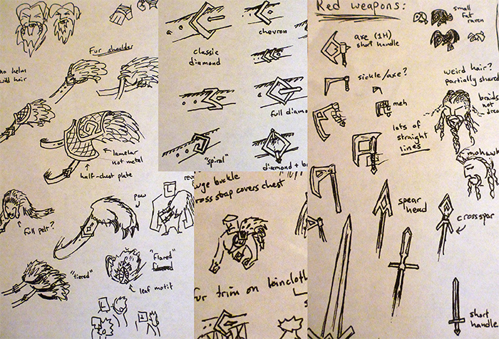
As with the other colors, he also sketched a page full of random details and bits that I could use for red, which was a huge time-saver.
Take a look at how the early Jarl sketch above translated into the final design, and all the yellow traits that it exhibits (which were covered in detail in Part 1) .
To make each color further recognizable, they each had their own background setting. Red scored the high mountains, but terrain from each class's recessive color sometimes bleeds in as well: in this case, forests from green, water and mist for blue, and stone spires from yellow.
There you have it: the creation of Norsaga's burliest heroes.


